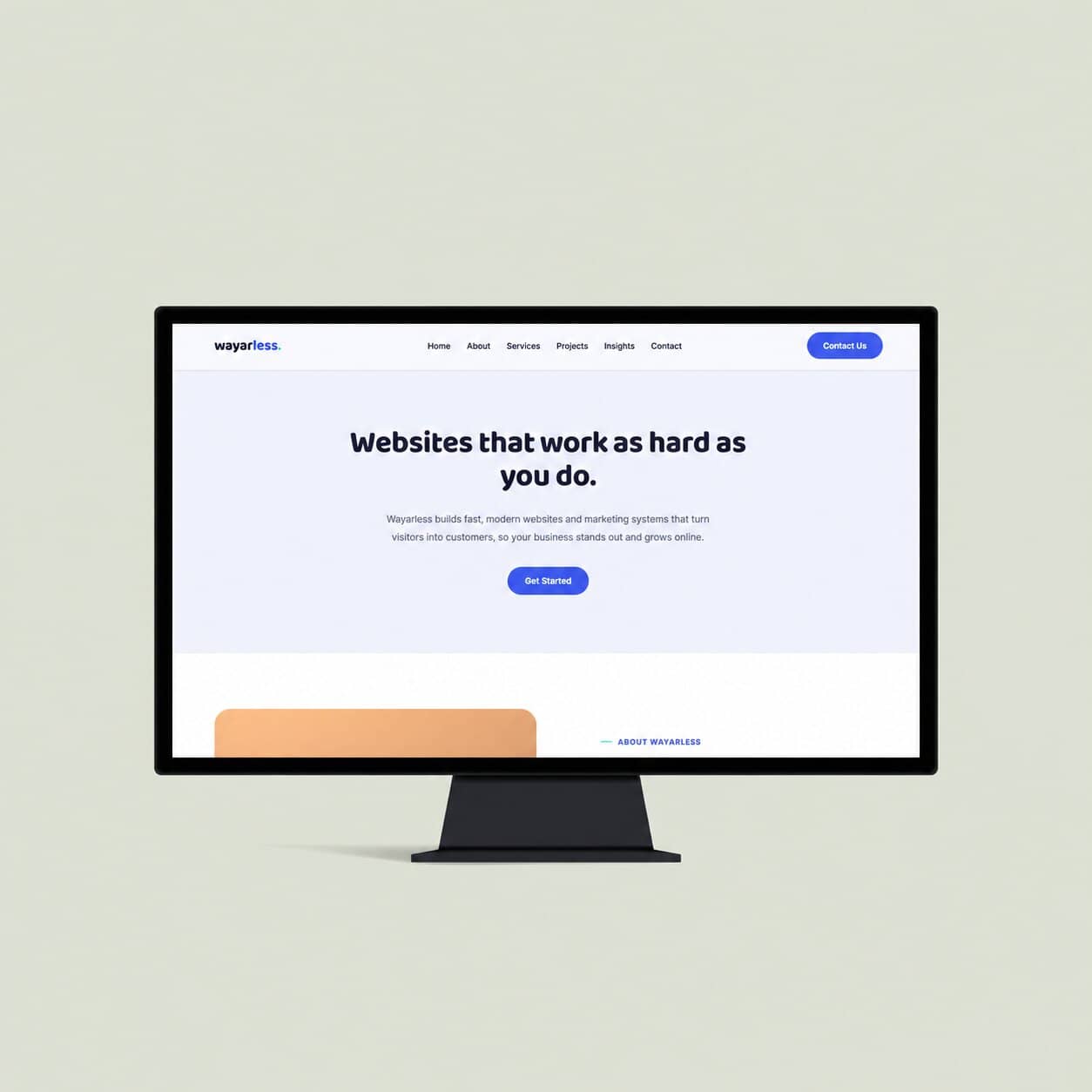
Overview
Wayarless was developed about a year ago, with one simple goal: to give the agency a digital platform it could rely on as it grew.
At the time, the website served its purpose. But as Wayarless evolved, so did our perspective on what the website needed to do. The original design began to feel outdated, stiff and, quite honestly, uninteresting. More importantly, it wasn't doing enough to turn visitors into meaningful enquiries.
The redesign was an opportunity to rethink more than just the visual appearance. We wanted a website that felt more welcoming and easier to navigate, while better reflecting one of the things we believe in most at Wayarless: the human side of digital work.
Rather than presenting ourselves as just another digital agency, we wanted the new website to feel approachable, communicate who we are, and create a stronger connection with the people and businesses we hope to work with.
This redesign became a chance to build a website that doesn't just represent Wayarless, it feels like Wayarless.
The Challenge
The old Wayarless website had served its purpose, but it no longer represented the agency we had become.
- A stiff and disconnected experience — The layout felt claustrophobic, with images and text competing for attention and little sense of visual or content hierarchy.
- A website we weren't proud of — For a digital agency, having a website that we ourselves weren't particularly proud to show was a problem.
- Nothing we wanted to confidently point people towards — We wanted to be able to tell a potential client, “Here's our website. Have a look around, learn about us and see what we can do.”
- A poor first impression — If this was the first thing a potential client saw, there was a real possibility they would simply move on and look for another agency.
- Knowing we could do better — We knew the capabilities were there. The website just wasn't doing them justice.
Ultimately, the challenge wasn't simply to make the website look better. It was to create something we could genuinely stand behind as a representation of Wayarless.
The Approach
We didn't want to make small adjustments to the old website. We wanted to rethink the experience from the ground up while keeping the existing Wayarless colour scheme as a familiar part of the brand.
- A complete rethink — We kept the core colour palette but redesigned almost everything else, taking inspiration from established digital agencies and studying what worked, what didn't, and how they communicated their value.
- More engaging, customer-friendly content — We moved away from simply listing what we do and focused on helping potential clients understand how we can actually help them.
- Transparency from the start — We introduced estimated price ranges directly on the Services page. Clients can now get an immediate sense of what an engagement might cost before exploring the individual service pages in more detail.
- Turning projects into journeys — Rather than simply showcasing finished websites, we introduced a client journey for each project. This allows potential clients to see the challenges others faced, how we approached them, and where Wayarless provided value.
- Showing the people behind Wayarless — We introduced an Insights section as a space to share our journey, discuss digital trends and news, and offer a more personal perspective on the work we do.
The goal throughout was simple: make Wayarless easier to understand, easier to connect with, and much easier to choose.
The Outcome
We now have a website that genuinely represents who we are. One that feels more welcoming, more personal, and, most importantly, one we can be proud to put our name behind.
The redesign gives us a stronger platform to tell our story, showcase our work, communicate our value and connect with potential clients. And with the new foundation in place, we can't wait to get the ball rolling.
Clear, simple websites that grow your business.
Your business deserves more than just a website, it needs an online presence that sets you apart and helps you grow.